Overview
Update Bixby's App Store preview designs.
Role:
Lead Designer
Lead Designer
Team:
CEO
Lead Designer
CEO
Lead Designer
Process:
Problem Definition:
The majority of Bixby app users downloaded the app at the suggestion of their property management. It is why their App Store preview layout flew under the radar being as plain as it was—and most-likely an MVP until the in-house designer role was filled. Bixby operated lean.
In the previous layout the app's screens were represented at a small scale and did not highlight product details effectively. The app's dark UI contributed to the illegibility of details at this scale as well. The layout also looked plain when compared to the company's website and marketing materials.
In the previous layout the app's screens were represented at a small scale and did not highlight product details effectively. The app's dark UI contributed to the illegibility of details at this scale as well. The layout also looked plain when compared to the company's website and marketing materials.
Previous App Store Preview – iPhone
Previous App Store Preview – iPad
Research:
The company's website has a friendly and accessible vibe as does the company's marketing materials. The App Store previews can mirror this for consistency. I wanted to experiment with the dynamics of the layout to evoke Bixby's approachable vibe.
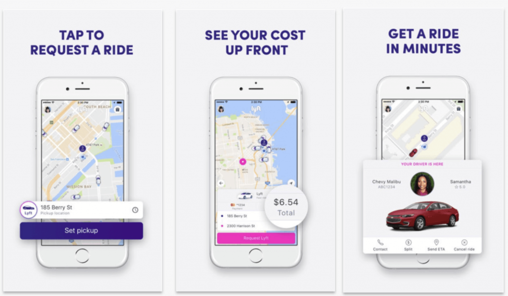
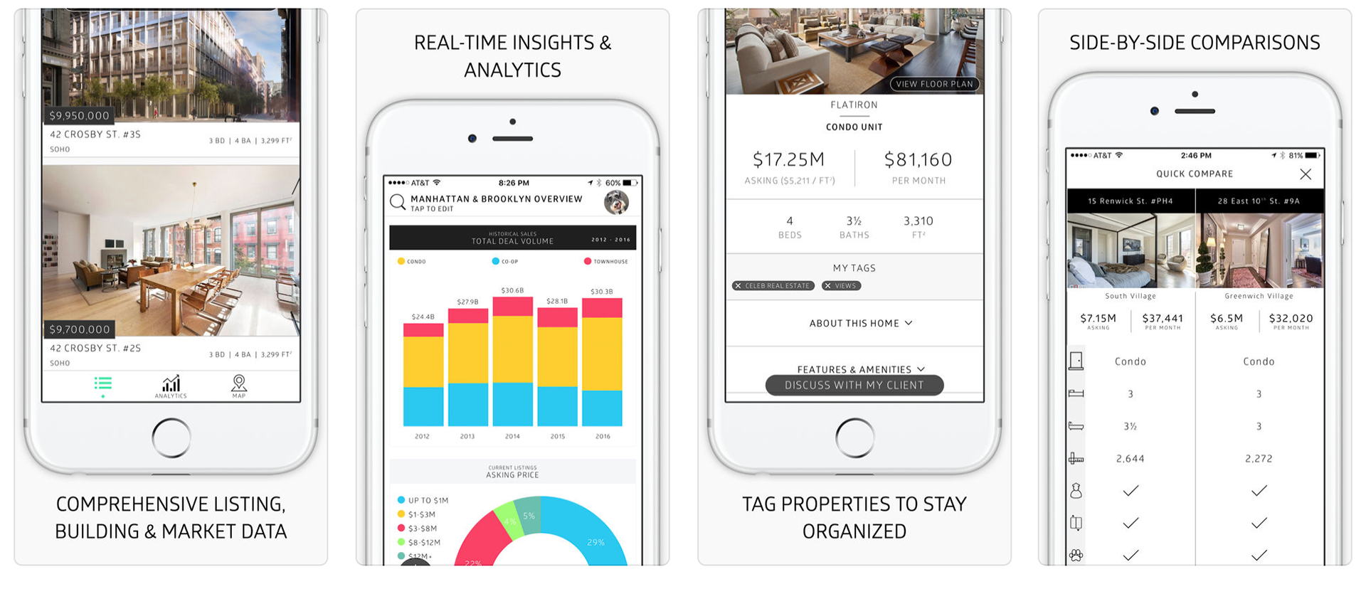
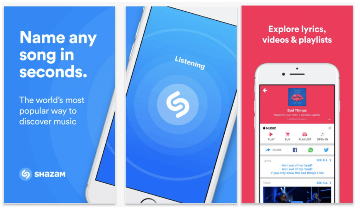
Below: App Store / Google Play preview graphics researched for inspiration.
Below: App Store / Google Play preview graphics researched for inspiration.
Design & Launch
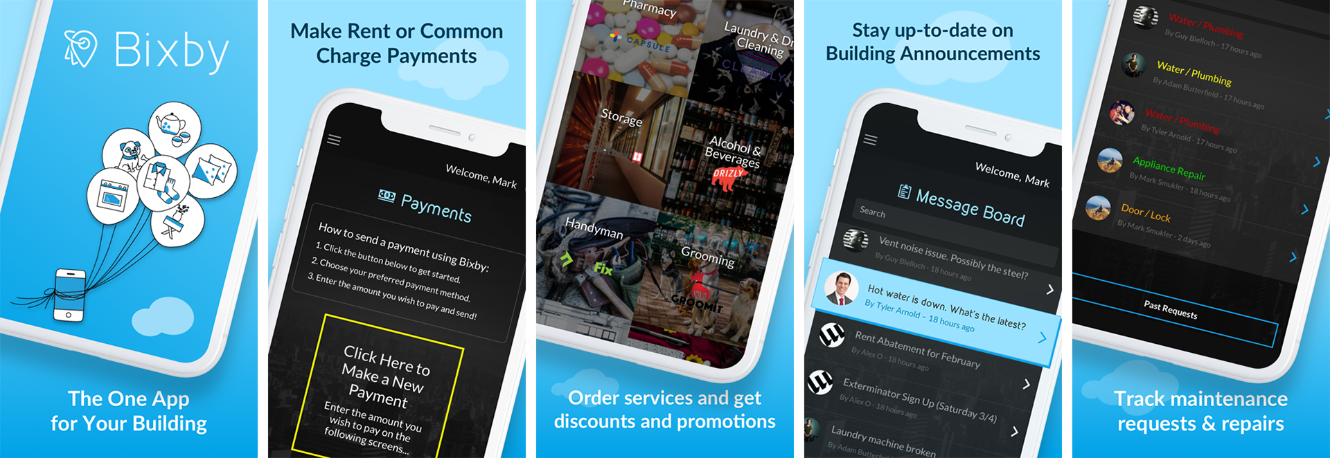
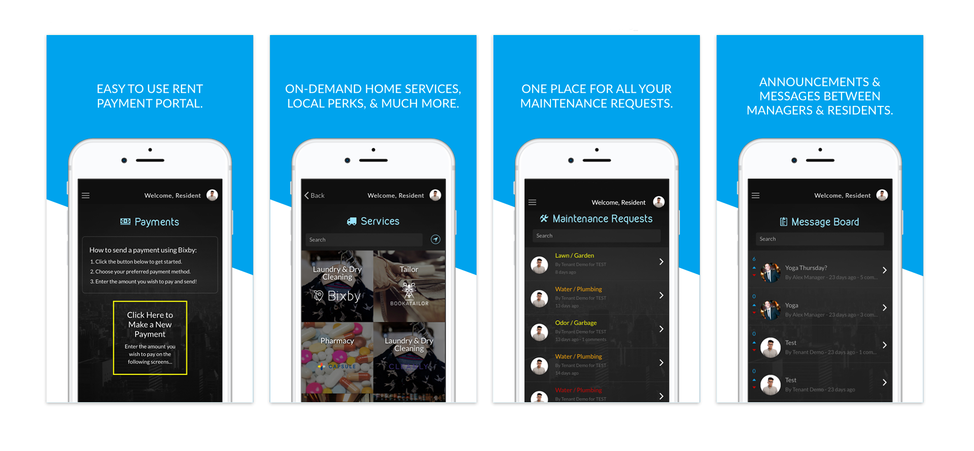
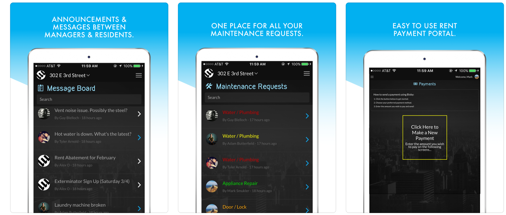
Increased scale a touch for legibility of text and details. Adjusted device's angle to add visual interest. The CEO wanted to use our balloon graphic and that inspired placing clouds throughout the other screens.
The list to the Message Board feature was monochromatic. To ensure the feature's purpose, a graphic was added to emphasize one of the list components as you can see on the fourth card below from the left.
The updated visuals (App Store / Google Play) were brand consistent and evoked a more approachable vibe.

Retrospect:
I would have liked to have the devices look as if they bled into the neighboring screens. I could not find exact measurements online to know how far apart the cards were from each other.
Since I was not the one to upload these screens to the App Store & Google Play, I would not be able to tweak the graphics until they aligned. As to not overthink it, I moved on.
Since I was not the one to upload these screens to the App Store & Google Play, I would not be able to tweak the graphics until they aligned. As to not overthink it, I moved on.