Overview
Design custom stationery to include onboarding materials to clients and potential partnerships.
Role:
Design Lead
Design Lead
Team:
Design Lead
CEO
Design Lead
CEO
Process:
Challenge:
"Thank You" postcards with the logo existed, but we needed ones with a blank side. Rather than reuse the same graphic, this was an opportunity to extend our stationery graphics.
Research:
For the new graphic, our CEO suggested that it should demonstrate the company's values. Our product is here to give our clients Comfort, Convenience, Love, Dependability, & Ease.
With this list of words, I created a secondary list to further break the concept down and find words and emotions that were easier to visually convey.
Those words then inspired: Time, Friends/Family, Love, Hygge, and Home Sweet Home.
The time saved from the convenience of Bixby's app allows our clients—property managers and residents—to spend it however they wish. Having an app that understands them so well creates a warm and fuzzy feeling which leads to feeling loved and the concept of Hygge.
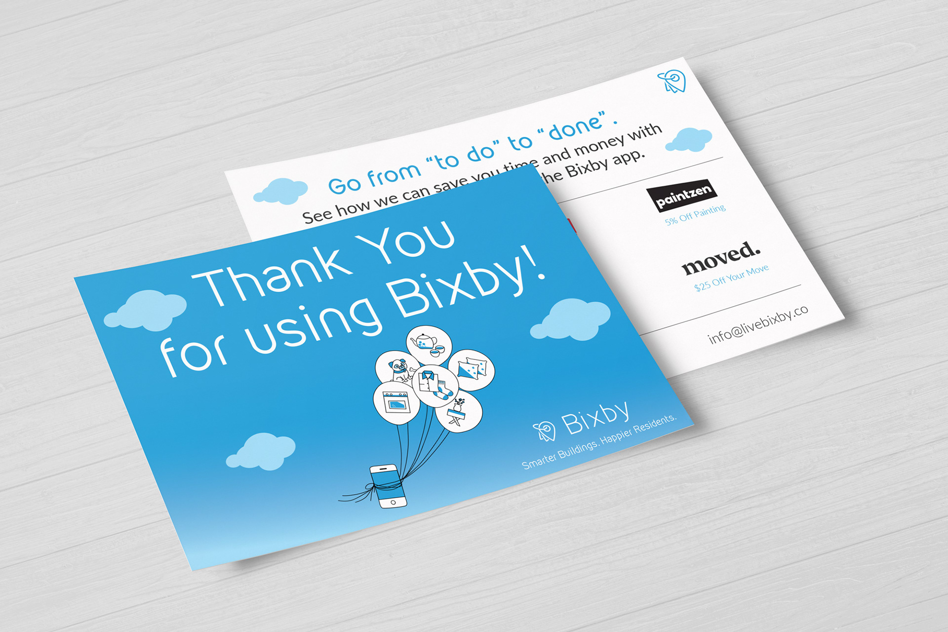
Existing Thank You Postcards
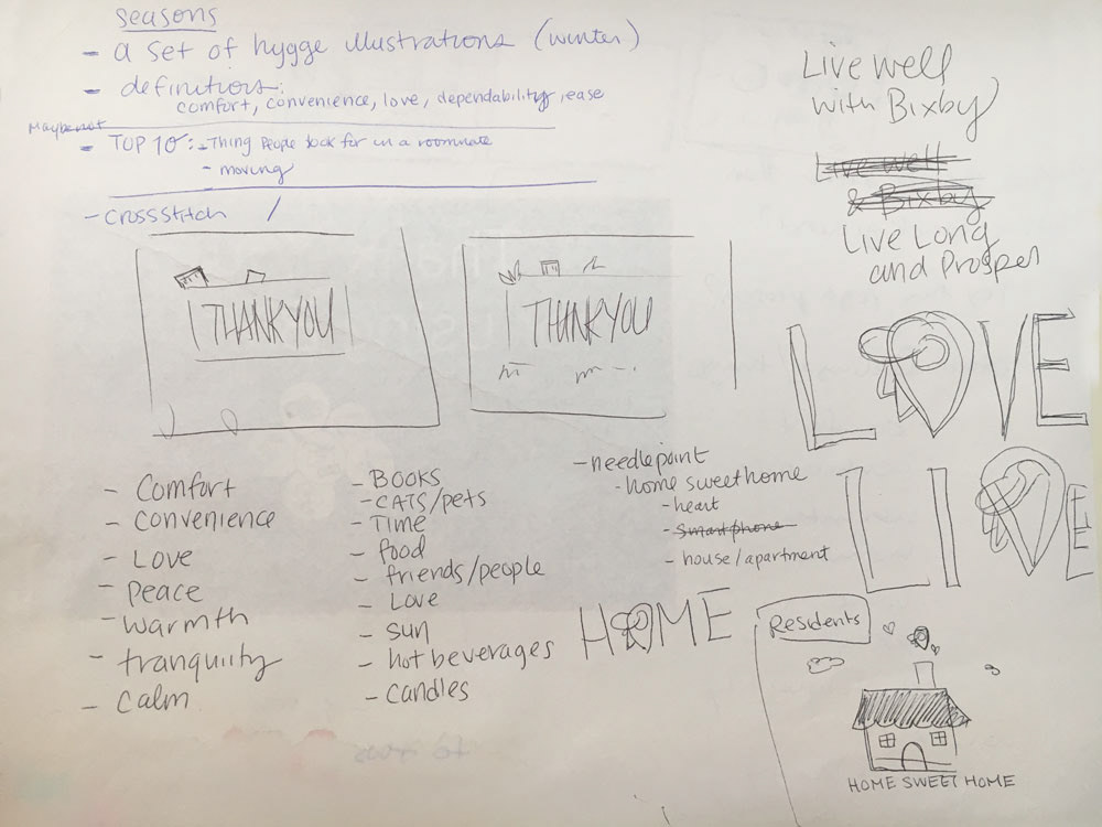
Initial brainstorming sketches for the notecards
Design Work + Explorations
I looked to design a graphic that was applicable to various recipients—be it with a new client's on-boarding materials, a partnership, or even a long-standing resident.
I liked Hygge and Home Sweet Home because these are the feelings the Bixby app makes one feel. To the property manager and resident, Bixby’s app gives them comfort, convenience, dependability, and ease.
Explored secondary icon of a house and combined it with Bixby's icon, creating a symbol that Bixby is the heart of the home and keeping it together.
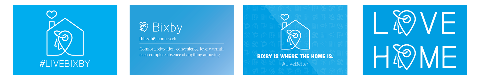
A selection of design layouts I explored
Solution
We went with "Bixby is Where the Home is" and gave it a border as a nod to a framed "Home Sweet Home" sign. This treatment to Bixby's logo successfully invokes comfort and dependability without losing the company's vibe.
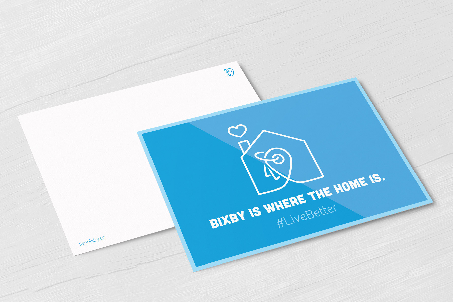
The Bixby is Where Home is was selected to go to print.